
In this article, you’ll learn:
Most companies spend $$ on ad campaigns, yet they don’t get people to convert because they overlook one critical aspect, i.e., the landing page.
Currently, the average conversion rate for landing pages across industries is 5.86%.
But if you want to go beyond average and double or even triple your conversion rates, you need to have the following 5 elements on your landing page.
1. Compelling Headline
“On average, five times as many people read the headline as read the body copy. When you have written your headline, you have spent eighty cents out of your dollar.” - David Ogilvy
The headline is the first thing your prospects see when they land on your page. If it doesn’t reel them in, they’re going to leave without a second thought, and you’re going to lose a customer.
So, follow these 3 tips below to create attention-grabbing headlines that evoke curiosity and compel people to learn more about your products and services.
Make your headline value-centric
Most headlines prompt people to take action instead of outlining what’s in it for their customers.
For example, “Read The Ultimate Marketing Guide” is a terrible headline because it doesn’t tell the readers why they should pick up the eBook.
But “Understand your customers, Stand out from the competition, and become insanely wealthy with the Ultimate Marketing Guide” draws readers in because it tells them what they’ll achieve if they downloaded and read the eBook.
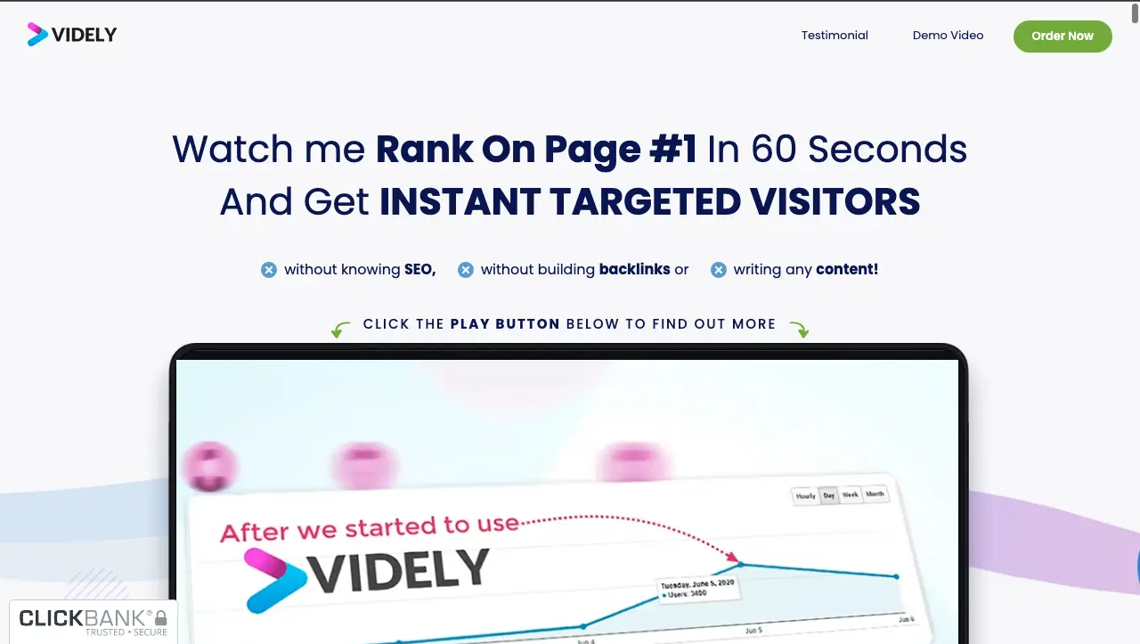
For example, look at this headline from Videly’s landing page. It jumps straight into the benefits and addresses hesitations prospects may have in the headline section, so they continue reading.
Be specific
Emma Williams, Founder of Digital Marketing Agency, Seene Digital, explains that, “Prospects are extremely wary of marketing messages because most brands make bold claims without backing them up.”
So, avoid using vague terms like “world-class”, “recommended by experts”, etc., if you don’t want to look like a snake oil salesman that’s out to get their money.
Also, your prospects can’t visualize or quantify these terms, so it doesn’t prompt them to take action and doesn’t add value to the overall message.
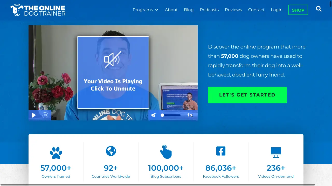
Look at The Online Dog trainer’s headline section on the landing page to get a solid idea of what we mean by specificity.
It doesn’t make vague statements like “many dog owners transformed their lives.” Instead, it gives specific numbers (57,000) to give owners an idea of the kind of impact the program creates and builds trust from the beginning.
Add a subheading
We know what you’re thinking:
“How does a subheading help make the headline compelling?”
A subheading draws the reader deeper into the page and gives them an extra nudge to take action. It adds more clarity and expands upon the idea mentioned in the headline, so prospects continue reading the page.
For example, check out ReVision’s subheading. It expands on how the supplement helps maintain a healthy brain and vision.

2. Clear Features and Benefits
“The market doesn’t pay you to have the best products or services. It rewards you for solving problems.” - Sabri Suby
You might have the best products and services in the world. But if your content marketing doesn’t tell your customers how it helps solve their problems, they will not buy from you.
That’s why you need the features and benefits section to show your customer how your products and services benefit them.
But before we look at how to craft a compelling features and benefits section, let’s look at the differences between features and benefits.
A feature is something your product has, and the benefit is the outcome your product will help your users achieve.
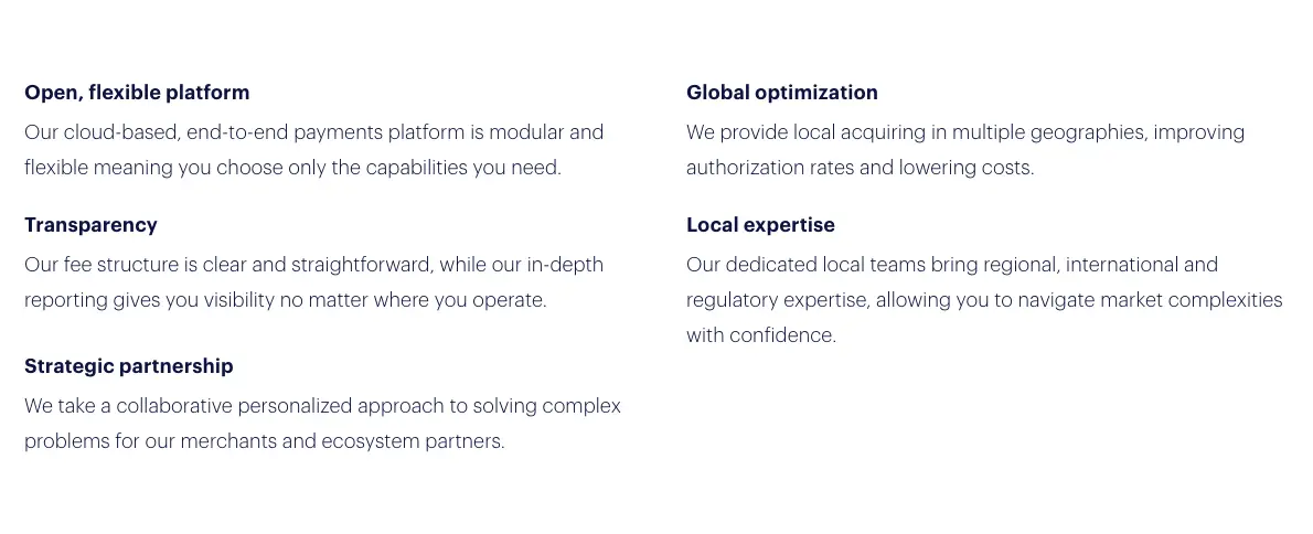
For example, look at the features and benefits section on Checkout’s landing page.
The headings describe the features of the services, while the subheadings (benefits) expand on how their services lower costs, reduce time, and solve problems efficiently.
You’ve got to translate features into benefits so you can attract a large audience and give them a reason to buy your products.
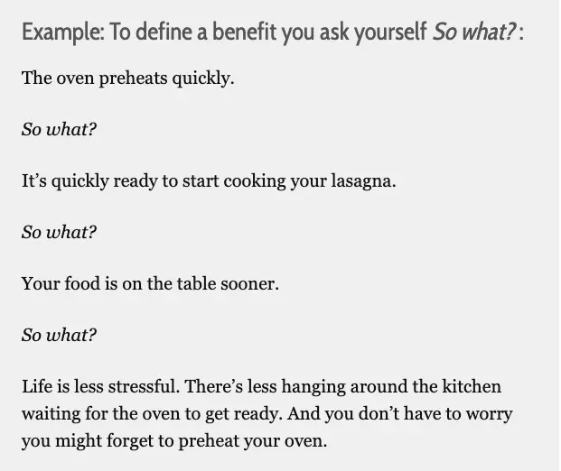
And to do this effectively, simply ask “so what” until you arrive at a reasonable answer. Here’s an image that breaks down this process.
The best part is that the “so what” trick works for any industry. Here are a few examples:
- We monitor your servers. So what? No more downtimes and losses due to server failure.
- We write high-converting landing pages. So what? Your conversion rates and revenue increase.
- We design beautiful kitchens. So what? You’ll feel at ease while cooking and impress everyone with the latest gadgets.
3. Social Proof
“Without question, when people are uncertain, they are more likely to use others’ actions to decide how they themselves should act." - Robert B. Cialdini
What other people say about your brand plays a vital role in influencing them to buy from you.
On average, 92% of people trust non-paid recommendations and 88% trust user reviews as much as they trust peer reviews.
That’s why it’s important to leverage social proof to boost your results. Here are 5 different kinds of social proof you can add to your landing page:
- Expert: Brand endorsements from industry experts. An example of expert social proof is an orthopedic doctor recommending a supplement that improves bone health.
- Celebrity: When a star vouches for your product. For example, you could be selling pens and getting an endorsement from Ronaldo even if they’ve nothing to do with your industry.
- User: This is the most common form of social proof, and it refers to reviews and praises from your users.
- Crowd: If you’ve seen statements like “X+ people signed up to ABC newsletter”, you’re already familiar with crowd social proof.
- Certification: This is when an authority or organization certifies that your product meets important standards. An ISO certification and a blue-tick on Instagram are examples of certification social proof.Another great way to enhance your social proof is to add Instagram feed on your website. This allows potential customers to see real-time user interactions, photos, and experiences, further strengthening your credibility and trustworthiness.
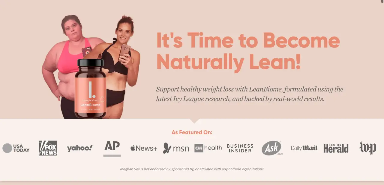
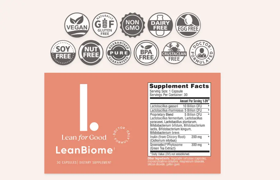
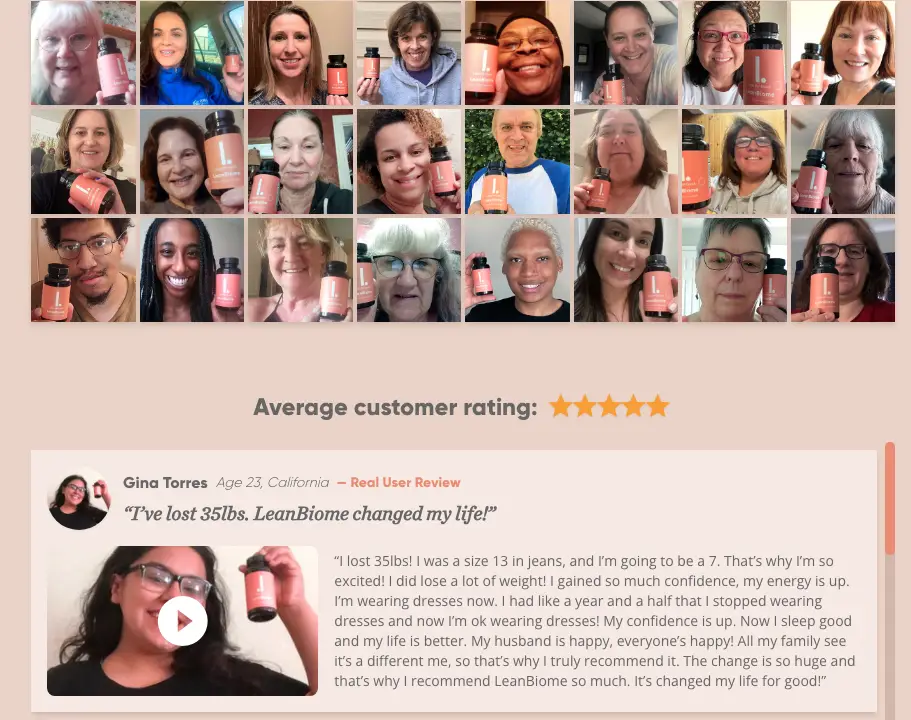
For example, check out how LeanBiome has leveraged social proof in different parts of its landing page to build authority and trust.
Since many weight loss supplements make dubious claims, they’ve added all the top magazines and news channels that feature them to prove their authenticity.
For vegans and those concerned with allergies and health issues, they’ve added relevant certifications from reputed and trusted organizations.
Lastly, the company has also added crowd social proof and testimonials from users to show that real people have had real results from using the supplement.
4. High-quality images
Pictures are worth a thousand words only if they evoke relatable emotions and get your prospects one step closer to taking the desired action.
So, you should pay close attention to the images on your website and choose them strategically to drive results. Here are 5 tips that’ll help you do just that.
- Consider your prospect’s awareness state: If your prospect is unaware of their problem, use visuals to show how inconvenient the problem is. But if your prospect is aware of your problem, then use desire-based visuals that show why your brand is the best solution to their problems.
- Use images of people: If you want your landing page to resonate with your target audience, use real images of people who belong to the same demographic as they do. For example, if your landing page caters to older women, ensure that the page has photographs of older women to get people to resonate with them.
- Reconsider stock photos: Unlike photos of real people, stock photos reduce your brand’s trust and authenticity because they look fake. But if you don’t have the budget to invest in professional, high-quality photos, check out websites like VisualHunt and Skuawk for authentic-looking stock photos.
- Reduce the clutter: An image’s purpose is to attract the prospect’s attention and work in tandem with the copy. But sometimes, brands incorporate “loud” images with flashy colors that distract prospects from the main message and make it hard to read. To avoid this, choose images that complement the copy instead of working against it.
- Read up on color psychology: Not every color has the same emotional effect on your prospects. Contrary to popular belief, blue doesn’t always symbolize trust. It can represent sadness or remind people of the ocean. So, to use colors in your images effectively, you should understand your customers’ emotions, culture, and symbols.
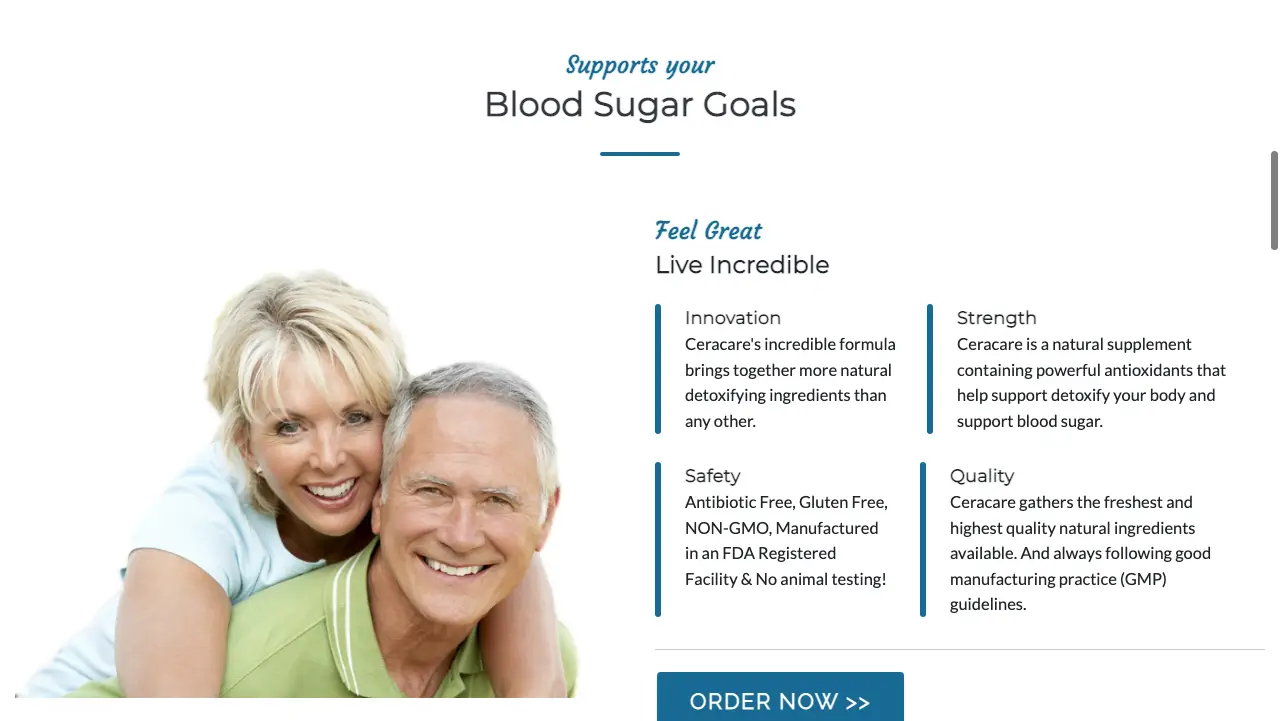
For example, the Ceracare supplement’s target audience is elderly people. Since they’re trying to tell their customers what an incredible life they can have with the supplements, they’ve included images of an elderly couple that look healthy and energetic.
5. Call-To-Action (CTA)
A CTA can make or break your website conversions. So, you’ve got to create CTAs that help your customers overcome decision fatigue and create a genuine sense of urgency to nudge them to take action.
Here are a few ways to make your prospects sit up and pay attention to your CTAs.
- Focus on the visuals: The primary purpose of a CTA is to stand out, so it should have a contrasting color to draw your prospect’s attention to the button. Also, use ample whitespace, so your CTA doesn’t get lost in the clutter.Integrating a QR code maker can offer mobile users a straightforward method to engage by generating a personalized code to scan.
- Use action-oriented words: The best CTAs get the prospect to react quickly. To achieve this, use short, commonly-understood action words that your audience can easily recognize when they’re skimming the article.
- Create a sense of urgency: Another way to drum up leads with your CTA is to trigger a sense of urgency with a lengthier CTA. For example, “Limited Time Offer. Get your FREE t-shirt” is more effective than “Get your FREE T-shirt.”
Note: If you’re using this tactic, ensure that the sense of urgency is genuine, as customers can see right through it if it’s fake.
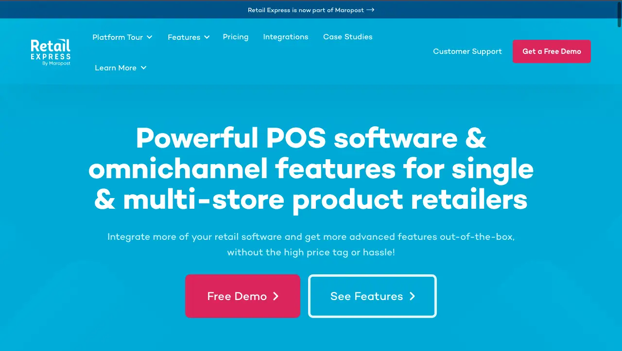
For example, look at this CTA button from the Retail Express. It’s contrasting and conspicuous, and it uses simple words that grab the audience’s attention while skimming.
Conclusion
A landing page helps you convert the traffic you’ve captured into leads for your business.
But most businesses spend thousands of $$ on ad campaigns and ignore landing page optimization. Luckily, transforming your landing page into a lead-generating machine isn’t rocket science.
All you need is a compelling headline, a features and benefits section, some social proof, high-quality images, an action-oriented CTA, and you’re all set!
Did you enjoy this article? Give Pics.io a try — or book a demo with us, and we'll be happy to answer any of your questions.
Author


