In this article, you’ll learn:
From entrepreneurs to marketers and graphic designers, everyone in the industry knows how powerful a branding tool a logo is. Some of the biggest brands in the world have iconic logos and people recognize their brands the moment they see them.
This much is the power of a great business logo. When you see a bitten apple, what comes first in your mind? Of course, it's Apple Inc. — a multinational technology & electronics giant. That is the most remarkable example of a minimalist logo design which has long been accepted as one of the world’s most recognizable logos.
Personalized logo design trends evolve rapidly. Many businesses keep changing their logos from time to time to stay in the trend. While some consider sticking with the informality of their old or current logos, some prefer to revamp their logos completely, keeping in mind the latest trends—as an attempt to attract target audiences with freshness in the graphic design industry. If you peep in the history of professional logo design, you'll get to know that hundreds of big companies, such as Google, Facebook, and Audi, etc., have gone through logo revamps from time to time.
After working in the graphic design industry for several years, we have observed that despite continuously changing the personalized logo or graphic design landscape, the minimalistic design trend has staked a significant place for itself in the recent past. Even the minimalism in graphics is expected to rule in the future. However, it can’t be misinterpreted that all logos or graphics look alike. In fact, businesses always look for various ways to maintain their individuality. You can experience that the current trends revolve around adding a unique twist on a minimalistic design approach.
Today, we are going to cover some of the deeper insight into future design trends. Also, we’ll analyze if minimalist logos and vector graphics are the future of branding.
What Exactly is Minimalist Designs?
The minimalist design believes in the "less is more" principle, which means your logo doesn't necessarily need too many colors, icons, etc., to be compelling and successful. In fact, people love a clear graphic design and have a clean aesthetic where fancy embellishments are imaginary.
Nike’s current logo—the lone swoosh, and Uber’s new logo are excellent examples of minimalist logo design. At present, the emblem is considered to stand for speed, athleticism, and exceptional quality in apparel design. Nike's logo has made a substantial impact. It’s known as one of the most recognizable logos in the world. While the Uber logo features a small abstract design and reflects "where we have been, and we are headed."
Even though these logos are simple, they’ve helped their respective brands to become instantly recognizeable.
Simply put, a minimalist logo and graphic don't need people to stress their minds to understand their message. This logo design concept makes a design easily readable.
Why Minimalism is a Hot Trend among Logo Designers
Minimalism increases the notion of clarity. Besides the fundamental principle of minimalism, i.e., less is more, there are many reasons why minimalism is a hot logo design trend among graphic designers today.
The biggest reason for minimalism being in trend is that a minimalist logo or graphic is memorable and leaves a lasting impression on the target audience. They can also fit on mobile screens easily. And it's a no-brainer game to make your graphics mobile compatible as millions of consumers use smartphones today.
So it becomes inevitable for businesses willing to target a tier audience; they must follow the minimalist logo design concept.
How Logo Designs Will Appear In The Future
Now, you may have got some idea about what logo designs will look like in the future. We can see that making a logo with simple and minimalist design have been successful, and we can assume that the trend will rule the graphic design industry in the future.
Since logos have become more powerful than ever before, logo design trends are rapidly evolving. But minimalism is one of the most powerful logo design trends.
The new logo trends equally impact new companies as well as old companies. Business owners and marketers find themselves at a critical juncture when they feel the need to change their existing logos with trendy ones to stay relevant by making them more appealing and modern.
After seeing the past design trends, it's not that challenging to make a decision. Minimalism design trend has established itself firmly, and that's why we can say that minimalism logos and graphic design is the future of branding.
However, we also see some other design concepts that have a great future in the graphic design industry. Have a quick look at them:
- Negative Space: Though graphic designers have been using negative space in logo design for years, the style is likely to stay in trend for years to come. Its charm is not fading anytime soon. We believe that it will have a particular space in the graphic design industry. You can see many creative platforms using negative space in their graphic templates. This can be seen as a testimony of negative space.
- Motion Graphics Logo Designs: Motion graphic concept has not yet become a significant style. But due to the ever advancing technology, this design concept is gradually becoming popular among logo designers.
- AI-Generated Imagery: no longer just a sci-fi dream, there's been a lot of breakthroughs in the area of using AI to generate UI elements such as logos. StyleGan 2 is one example of such a model. Researchers train the algorithm by feeding it a variety of images (such as objects from real life and existing logos) and then ask it to create logos from scratch. Although far from perfect, it had shown a lot of promise. We'd wager that it's going to be especially useful for minimalist design logos due to the style's lack of complicated shapes and detailing. Most recently, Adobe had started offering free logo maker online at their website, so it might be a good starting point to try out the technology, as well.
How DAM can Help With Your Branding
As you may have noted, there are many compelling arguments for minimalist logo design. There might be just enough to make you seriously consider that it is about time your company's branding got a coat of new paint. It isn't as easy as just turning a dial to 'minimalism,' however.
Think about every place where you brandish your logo: corporate website, SM pages, banners, printed press, merchandise... the list can go and on, but you get the idea. For the first iteration of the corporate design that does not pose that much trouble: you design everything once, and then you're good to go. But when we're talking about changing things, though? There isn't a person in the world that can keep track of all these figurative nooks and crannies. That is why proper brand asset management is key to a smooth transition from here to there.
Digital Asset Management (DAM), such as Pics.io is a tool that can help you to maintain consistent branding. Due to powerful customization options, there are many ways you can do it, but here's an example that we believe work really well.
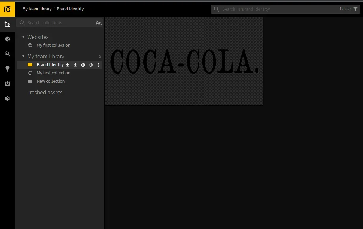
Let's say you have all your brand assets stored in Brand Identity folder.

As an example, we're going to use Coca-Cola's original logo, and assume that this is an image that they're using as their main large banner. It is about time to change it to the iconic cursive logo that we know and love. Pics.io's version control feature seems just like a tool for this.

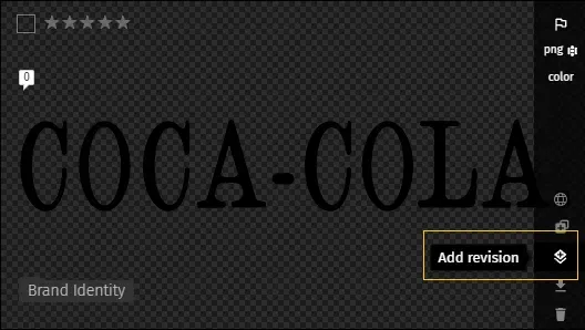
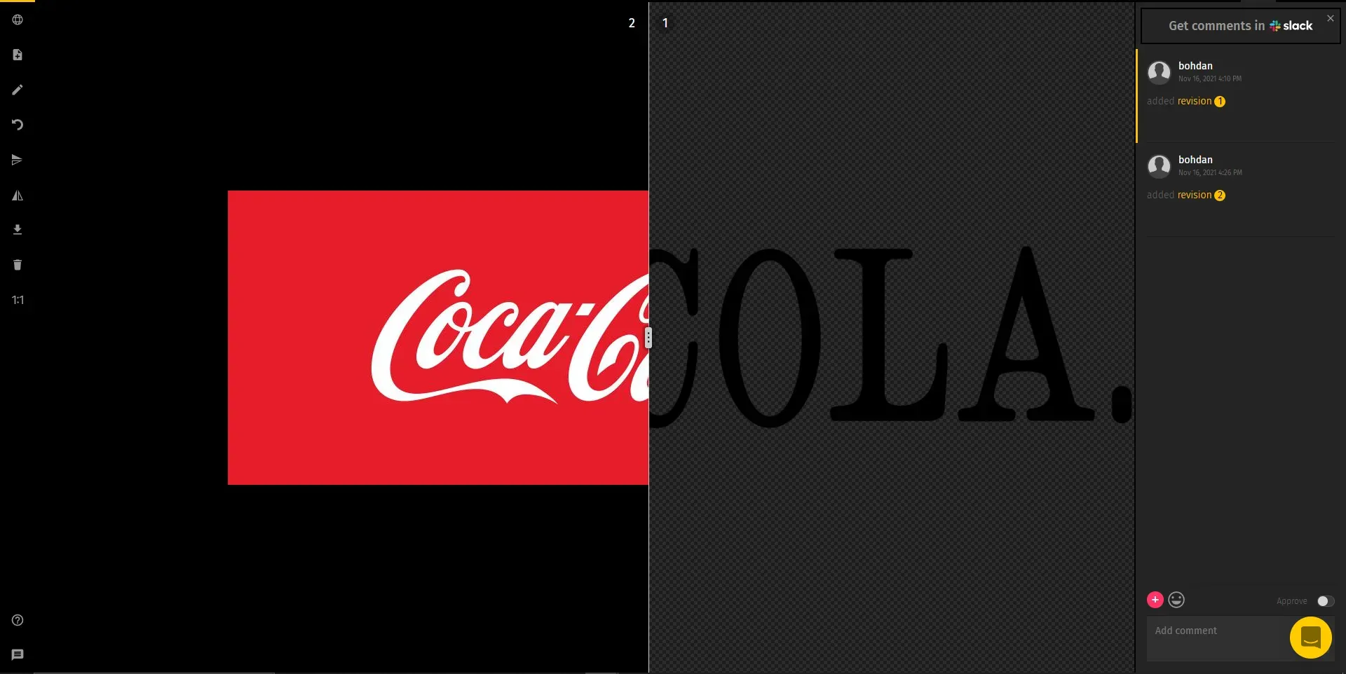
We are just going to click add revision here and add the logo that we all know and love. Once you do so, both old and a new logo will be accessible from a single screen. And you can always see what has been changed before approving the revision using the compare tool:

So, the next time your designer or a salesperson will go to grab an up-to-date brand asset, they won't have to stumble figuring out which version they can use!
Final Word
Now, you can understand that how significant the minimalism concept is in logo and graphic designs. When you design your logo for your business, you should consider keeping it simple, straight, and memorable. Many notable players use minimalism as well as graphics animation on their websites to look energetic, vibrant. You can also choose to use negative space in your minimalist logo design. Adding some animation can also work.
Regardless of your approach to corporate branding and if you vibe with minimalist style or not, Pics.io can always be a right tool for the job that can help you maintain consistent and powerful branding!
Hope this post would help you justify your selection of minimalism in your logo designs.
Cheers!
Curious? Learn more about Pics.io or book a demo with us and we'll answer all of your questions!
Author
Henny Kel is a digital marketer, brand consultant, and business strategist with Designhill, a reliable marketplace for logo design, business cards, web design, T-shirt printing, and other graphic design products. With extensive experience working both client side and within the agency environment, he has authored several articles on topics related to digital marketing, business strategies, and content marketing. To learn more, connect with Henny on Twitter or LinkedIn.


