
In this article, you’ll learn:
Presentations can make or break your speech. Whether you own a startup and need to pitch or share new product features with consumers, the information needs to appear both in a professional and visually appealing way. You know this if you have presented at school, pitched a startup, reported to clients, or listened to the addresses of your colleagues at a meeting.
As a marketer, you have to share a lot of information on your newest campaigns, product changes, and much more with the public. To do this more creatively, you should consider engaging and educational presentations.
But how to do this if you don’t have any design skills?
This is an article for non-designer marketers who want to create outstanding presentations professionally. In our guide, you will discover how to choose proper presentation tools, where to begin, avoid common mistakes, and create a successful presentation, even if you are doing it for the first time.
What are marketing presentations?
We have all attended a public speech with an excruciatingly dull presentation. Whether it was your drunk uncle at a wedding or your boss dragging through the meeting notes, slides overloaded with information, the speech was monotonous, lasting forever, and someone was yawning in the hall.
The content of such addresses never sticks with you.
A presentation is a form of information introduction with or without the help of different tools and techniques. Usually, new projects, products, services, and ideas are introduced through presentations. The goal of a presentation is to ensure that the audience is listening and interested in the subject. A good presentation is easy to spot: it helps keep the audience engaged. A good presentation is clear, to the point, and caters to the audience. That works the same for public speaking, toasts, product pitches, and website presentations.
Like banners, promotional imagery, and landing pages, presentation is a valuable tool in a marketer's arsenal. And - as any marketer would tell you - it's not only about creating a great tool but also understanding of when and how to use it that can make or break your efforts. To the latter end, understanding the nuances of marketing asset management becomes quite important.
As a marketer working on a presentation templates of a product or an idea, all you need is a comprehensive design accessible for your audience. So let’s get into using images, writing clear and persuasive headlines, and working with detailed figures and videos that will allow your audience to concentrate on your speech and grasp vital information from your visuals.
Tools for creating excellent presentations
There are many presentation-making tools available, but of course, there isn't one that fits all.
Please note that, according to the importance of your project, you can also order a product presentation from a professional presentation designer. For example, suppose you're pitching a complex, transactional email marketing campaign to a potential client. If you don't have the time to learn how to do it yourself, you need to hire a designer.
However, here we have the most common tools that help non-designers make creative and informative presentations.
PowerPoint
Even though it is a bit outdated for some people, it's a great starting point for someone just getting started with presentations. Powerpoint is a classic editor for creating presentations. If you have never used Powerpoint, you might be familiar with its counterpart Google Slides, which is available to use online. However, most of the features and functionality are the same.
The powerPoint editing interface is easy to navigate, simple and convenient. You can handle PowerPoint if you know how to deal with Word. It also can be stored on Google Drive. You can also use PowerPoint templates which will make your job so much easier. Pick a template and duplicate the styles as you go forward. You can save files in many formats, including PDF.
In all honesty, the downside to PowerPoint is that it's a bit difficult to use. And because there are so many no-code technology easy-to-use website builders, presentation-making tools, and software out there, people lean towards them.
Keynote
Keynote is the Lite version of PowerPoint for Macs. In Keynote, it is easier to make slides because its functionality is reduced to the bare minimum. Keynote, unlike PowerPoint, is not as confusing, especially if you are a user of Macs.
Powerpoint requires two or three clicks to execute an action instead of one click in Keynote. When you make several dozen slides, the amount of time lost in PowerPoint is enormous. On the flip side, Keynote has all the simple editing tools you'll use. Nothing sophisticated. Your files can be saved in different formats, even pptx. In this situation, though, the presentations and formatting may be a little off.
Canva
If you start using Canva, you will forget about all other presentation-making software. You can create stunning presentations that will engage your audience with Canva for free. There is also a premium plan with more features and functionality, but before committing to pay, take advantage of the tool for free to see if it's comfortable for you to use. It can easily be accessed through your web browser.
Canva also offers apps, but before going mobile, try mastering the desktop version first. This presentation software provides free access to hundreds of creative slides on any topic that will make creating a presentation into pleasure. Whether your presentation is for mobile app promotion or showcases a new product, Canva offers a wide variety of options. Just pick the perfect free images right from the software, use advanced fonts and colors-and tastefully convey your message to your audience. The platform even provides a selection of awesome Instagram story ideas in case inspiration doesn't come along.
Prezi
Regardless of whether you're a university student or a business professional, Prezi is very versatile. It is a web service that allows you to create interactive multimedia presentations with a non-linear structure.
Prezi also allows scaling animations which are brand signifiers. If you have seen a presenter rapidly zooming in and out during their presentation on the same slide, chances are it was on Prezi. Unlike a classic presentation made in Microsoft PowerPoint, which splits presentation into slides, in Prezi, the main effects are not associated with the transition from slide to slide but with the enlargement of individual parts of each.
Decktopus AI
Decktopus is an AI presentation tool that works for anyone who needs to go from a topic, uploaded file, or rough notes to a complete, on-brand presentation in minutes. It handles structure, content, and visuals in one go, so you spend your time on the message rather than the formatting.
What makes Decktopus particularly useful for marketers is its Brand Kit, which applies your colors, fonts, and logo automatically across every presentation you create. A built-in brand compliance check flags anything off-brand before it goes out, and the Loop AI Delivery Coach lets you practice your presentation and get real-time feedback on your delivery without ever leaving the tool.
How to get ready for a presentation
How to make a beautiful and captivating presentation?
Before you sit down to create a presentation, create a project roadmap ask yourself a few questions:
- Who is your audience?
- What is the main idea of your presentation?
- How will you articulate it?
- What do you want people to take away?
The better you prepare before creating the presentation, the faster you'll get ready.
Get to know your audience
Make sure to get to know your audience if you want to influence their point of view. After all, you are doing your Influencer marketing. Surprisingly, some presenters don't seem interested in their audience when preparing presentations. The presentation should suit the audience, just like the dress code during your presentation. If you meet with the audience for the first time, pay attention to their age, profession, and position.
Conventionally, any audience is dominantly one of the three types:
- Emotional
- Factlovers
- Visionaries
How to understand who is in front of you?
Emotional
Usually, these are the people of creative professions - designers, art directors, photographers, creators. To gain the trust of such an audience, use emotion. It could be a joke or a powerful emotional image. How to make a presentation for inspirational people? Use vivid, persuasive visuals where mood matters most. In addition, make sure to stay in touch with the trends. If you are presenting a new podcast concept, check out podcast trends. Emotional listeners will value this input.
Factlovers
These are scientists, accountants, IT departments, lawyers, C-level executives, etc. They don't care much about the emotional aspect of your speech. They want to see the facts, information about a specific product feature or an offer condition. Therefore, it is better to convince them through facts using charts and graphs. If you're reporting about a product's success, make sure to include some customer feedback.
For them, presentations should be designed in a more reserved style, and the story itself should be based on expertise and assessments. It does not mean that such presentations have to be complicated and tedious.
Visionaries
Visionaries include all strategically-minded people - managers, executives, the board of directors. Marketers report to visionaries on all sorts of data, for example, Instagram follower demographics of your social media marketing campaign or budgets. If you are a social media marketing manager, you get to interact with visionaries all the time. One of the essential skills as a social media marketer is planning and effectively presenting a social media budget. After putting together the budget for your expenses, you can start visualizing it for your presentation. Remember that you need to include all external and internal fees. For example, if you’ve hired a third party to create content for you, you can calculate the return on your investment.
Both facts and emotions are equally important to them because they think with results for the future. So offer them solutions, numbers, and paint a picture of how this will make a difference in the future.
Define a topic and goal
Good presentations always have a central message that runs through the entire speech. It could be a call, a push for a decision, or a plan. Without a clear idea, presentations turn out to be chaotic and confusing, and it can be difficult for listeners to understand what the author wants to say. The main idea should be short, simple, and memorable as a motto or slogan. This essential component can be executed in a notebook.
You begin by selecting a topic, defining a purpose, and arranging the arguments correctly. Only then can you open the presentation software and start looking for visuals for your presentation. Teach your audience how your product or service works and how users engage with it. You can check out the most funded Kickstarter to see how they do it. You should also consider researching various funding competitions to discover what presentations get more success. People's real-life experiences, program screenshots, and live product images are more powerful and trustworthy than dry text and stock photos. If the information is meaningful and serves to help convey a message, black letters on a white background can still look great.
The topic should be specific enough to solve the problem you are talking about at the end of the presentation. Reduce the scope of the presentation until you can express it in 10 brief paragraphs. A good topic itself will help you with the structure of the speech.
Suppose you are trying to improve the talent management process in your company and have to approve some additional funding from your manager. A successful presentation objective starts with the question, "What do I want to change in the audience's behavior?" An excellent presentation may alter people's perceptions of the world. For example, people are becoming more concerned about the environment or encouraging them to run and get their hands on a new smartphone. The objective does not have to be aspirational; what matters is that it should be specific.
Create a scenario
Assume you're working on a novel. Scenarios work the same way in a presentation.
The audience must be intrigued, and you must create a captivating character and guide them through obstacles to a triumphant finish. Such structure is often used in fairy tales, movie scripts, and product advertisements: the viewer should determine from the first slide what they will get or learn. Therefore, it is preferable to eliminate creative clutter and clarify what will happen next on the cover or the first slide.
Then it would help if you intrigued your audience's interest. Create enough suspense to get the audience's attention and convert it into listeners. Create motivation for your users to stick to the second slide. Explain the presentation's advantages or create tension. The next step is Thesis. That is the central point of the presentation, the lesson you aim to teach the audience. Then comes Antithesis. Show alternate points of view. That builds trust and forewarns against potential difficulties in practice.
The last part is the conclusion. "That's it," says a mediocre presenter at the end of their presentation. Never do that. Give a summary or close at the end. Make sure to include your contacts on the slide. You can use an email signature generator as a template for containing the essential information on the slide.
Visuals Matter
Presentation is about two things: your speech and visual aids. The majority of inexperienced presenters type out their notes in a bullet-point format on the big screen. Maybe they'll throw in a graph here or there. Such an approach might work in certain circumstances, but we are talking marketing here. Marketing is all about selling your idea and but a few things sell your idea better than vibrant and striking imagery.
When it comes to selection, the world is your oyster. You can just handpick some free stock photos from Unsplash and similar services, make visuals yourself or commission them from a specialized company or do them in-house. These options (especially the last two) would expect some due diligence from you if you want to make your presentation pop. It's not that simple as picking the first random image and dropping it into your presentation. Some work is to be expected.
Digital Asset Management (DAM) software such as Pics.io is just a thing that you might need. On the most basic level, DAMs allow you to keep your soon-to-be slides secure, in a cloud, and accessible from everywhere. Digging deeper, you can discover that DAMs also boast some useful features for designing assets such as version control, commenting with instantaneous feedback and much more! That way, your assets will always be in order, and you'll have plenty of time to create a presentation and decide the best way to make it pop, instead of wondering where the hell did you save your valuable photos and pictures!
Choose fonts wisely
A presentation font may assist you in acquiring new customers, making your presentation writing more readable, expressive, and presenting the essential concepts more effectively. However, beginners may be confused by the diversity of presentation fonts and pick an obscure or inappropriate one.
- Montserrat

Montserrat is a short, minimalist presentation typeface that reads well in typical style and is appropriate for bold headings. Suitable for items that need to give a friendly and welcoming ambiance while maintaining a professional tone.
These presentation typefaces are often linked with health, farming, and the restaurant industry.
- Geometria

Even beginners are familiar with Geometria. It is a trendy presentation font. You can make comprehensive presentations using this font. It has proportional letters, a simple shape. This is an excellent typeface for a company's business presentation.
- Open Sans

The best presentation fonts of all time are impossible to imagine without Open Sans, the most popular font online. It is used by default by many Internet services and apps. It's adaptable and may be used for presentations on any subject.
- Roboto Condensed

Because it was created mainly for the Android operating system, Roboto is an excellent display typeface. As a result, it makes it appear impressive on mobile devices and other displays and projectors. This font may be downloaded and installed in PowerPoint or any other program.
- Clear Sans Regular

Clear Sans Regular is another presentation typeface that looks great on all screens.
It appears to be both presentable and trendy. You can generate effective presentations connected to the world of music, digital services, and multimedia. It’s also effective for user acquisition ads in display network banners, etc.
- Prosto

This is another excellent choice for a presentation on digital technology. If you want to seem techy and futuristic in your presentation, this is the font to choose.
Use trending colors
Every fall, we learn about the color trends that will be popular the following year. You can find Facebook influencers, brands, bloggers, entrepreneurs, and online publications that use these colors to create distinctive color schemes to remain trendy. You can always draw inspiration from their content. To help you make a fantastic presentation, we've created a list of top color trends.
Trend No.1 Cheerful colors
For many, 2021 symbolizes the conclusion of a long period of isolation, uncertainty, and economic turmoil. We confronted so many limitations in 2020, and we were so exhausted by monotony and regularity that designers now provide us some fun. This spring, for example, expect to see a lot of bright, cheerful, lively, and rich colors on the runways.
- Optimistic Colors
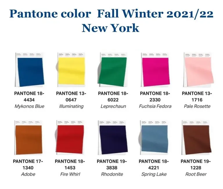
The Pantone Color Institute, a global authority in design, selects the current palette of New York Fashion Week and London Fashion Week every year. The Pantone Institute is inspired in its decision by societal activities, including fashion, politics, and social media management trends.
Bright and saturated hues will be fashionable at New York Fashion Week, according to Pantone Institute experts: golden orange, heavenly blue, sunny, deep blue, green, coral, refreshing menthol, and attractive color of raspberry sorbet. Colors blend comfort and tranquility with power that inspires, elevates moods, and encourages you to do new things with your style.
The vibrant hues of a spring garden are perfect for designing patterns that will draw attention and inspire positive feelings.
Trend No.2 Technological colors
Colors associated with tech products are the second trend. Global digitization and technological progress will be fruitful for forming a substantial variety of trends in the following seasons, including the upcoming season's trendy colors—one of the most technologically advanced palettes. In 2021 five fundamental colors manifested the spring/summer 2021 season. The dominant colors for next year are Aqua, Lemon Sherbet, Oxy Fire, Good Gray, Quiet Wave, gray-blue A.
- Good Gray
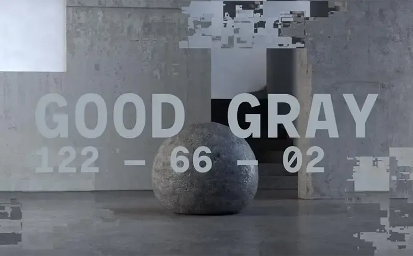
The eco-friendly gray is reminiscent of the unprocessed, mixed color that results from combining several elements. It is the most neutral color in the palette, and one of its tasks is to balance and neutralize the other brighter shades. However, because it represents the concept of simplicity and helps you build a harmonious presentation with a calming vibe, it can be used on its own.
- Lemon Sherbet
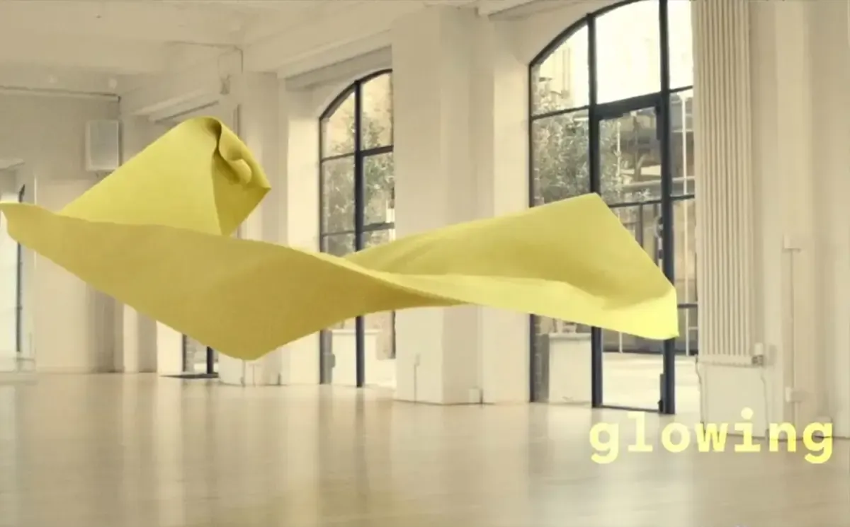
Yellow has long been a problematic color to employ in presentation design, but more practical examples of its application have developed in recent years. Lemon Sherbet is a subtle shade of yellow that evokes the sun's warmth and has a soothing effect. Consider using this color in your presentation only when you want to express these feelings, but try not to overwhelm your listeners.
- Oxy Fire

The observer will undoubtedly react to the fiery, passionate, and extroverted red. Oxy Fire will take the place of the classic red and trendy orange colors, which have already been shown to be successful in the marketplace. Unlike the Lemon Sherbet, Oxy fire does not exude calmness. However, it can still be decisive in a presentation if you are trying to express anger, danger, or some feeling of being alert.
- Quiet Wave
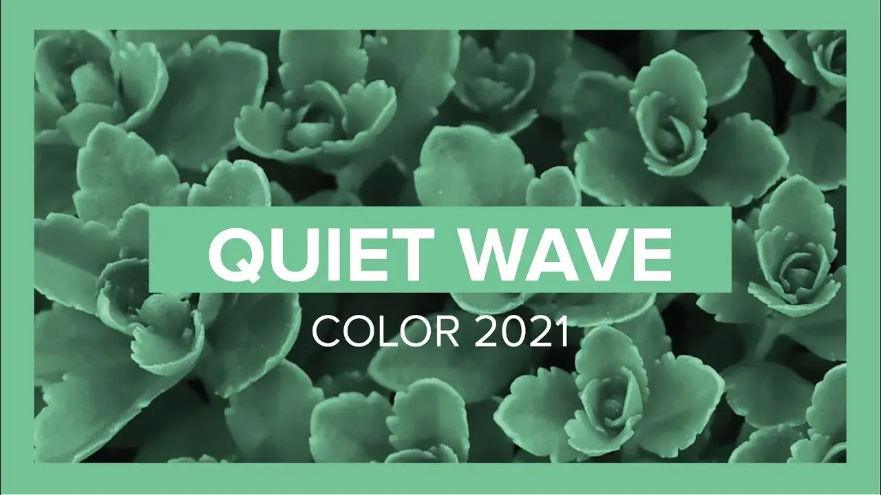
Since there has been a lot of attention to environmental issues in recent years, green is also included in the palette of trendy colors. However, this season, we are treated to a lighter, whiter, and more relaxed version, influenced by technology rather than nature.
In 2021, trendy tech colors are ideal for presentation or multimedia design. This type of green doesn't only have to be associated with nature. You can make modern, athletic, or futuristic designs for your website, presentation, Facebook, or Instagram with this color. It also works well if you ever decide to integrate chatbots on your website. Combine this tech color with a gradient effect for a unique look. In animated designs, rich tech colors look fantastic. Try it out. It is sure to attract your audience's interest.
Presenting your speech
If you get to know your audience, formulate your message, communicate it clearly and straightforwardly, your presentation is already on the way to success.
Now you can go further and explore presentation creation tools, choose an appropriate font and color.
- Rehearse your speech
Practice your speech before speaking. This will help eliminate the fear of public speaking and forget your words at the most inappropriate moment.
Share your presentation aloud several times with a listener and watch their reactions. If they get bored and leave the room, add something fun to the slides, such as animation or a meme.
- Speak slowly
A fast-paced voice gives out nervousness and diminishes the credibility of the narrator. People like slow speech and a low timbre of voice much more. Take your time to deliver your presentation as soon as possible; instead, give yourself time to breathe as you speak.
- Talk to the point
Try to keep it short, like 10 minutes and ten short paragraphs. The audience will lose interest if you last more.
- Use slides as background
Remember, during your presentation, you are the focus of the audience. Therefore, the slides shouldn't be duplicating your words or be the center of the action. Instead, bring illustrations, key messages, and pictures on them, and tell a good story yourself.
Conclusion
Creating a presentation is a challenging but fun and creative task. First, dedicate time and effort to understanding your audience, what you want to share with them, and how you want it. Then, use those insights to craft a presentation that will not simply share the information with the audience but do this in a catchy and memorable way and spark a meaningful two-way conversation.
Curious? Learn more about Pics.io or book a demo with us and we'll answer all of your questions!


