In this article, you’ll learn:
Per EduBirdie's survey, 59% of respondents claimed to base their purchasing decisions on the marketing emails that they receive. Successful email marketing can make or break the business' success.
To stay ahead of the competition, check out these email design interpretations that can give you a hint on how to change your email marketing strategy.
Welcome Email Design
A welcome email is the first newsletter you send to new subscribers. In addition to the welcome note, the email also introduces the client to your brand.
Be sure to personalize your welcome emails to lay a good foundation for future newsletters.
Sender.net Welcome Email Design
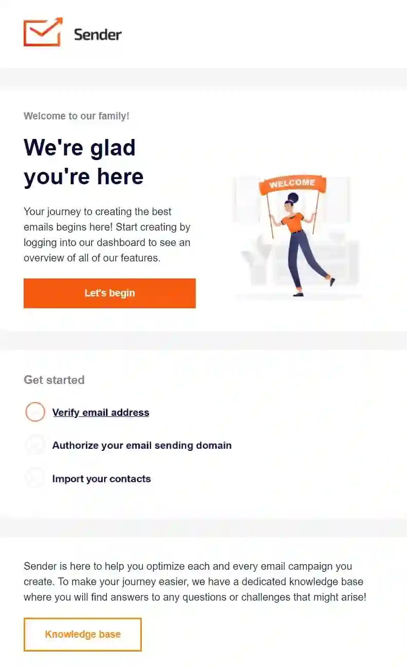
Sender's design is very well in line with modern design trends. On top of the expected introduction, their design signalizes the modern sensibilities and willingness to innovate.
HBO Welcome Email
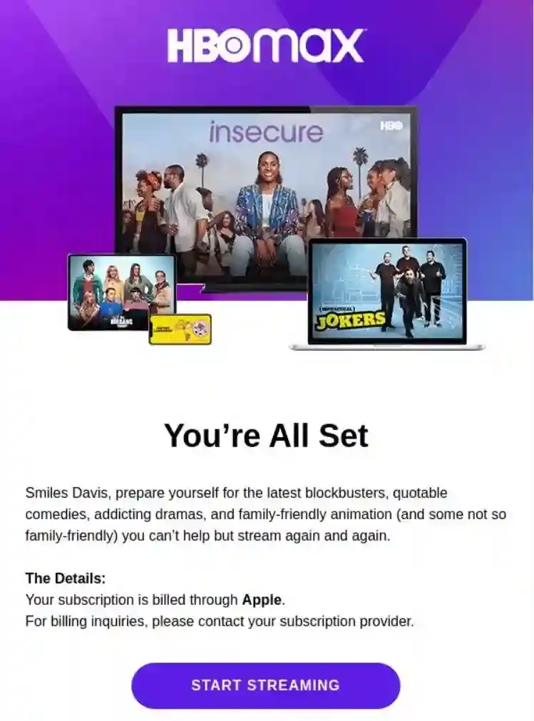
HBO's welcome email integrates some of the up-and-running shows into its design, informing new customers on how they can use their new subscription.
Product Promotion Email Design
Product promotion is the most common type of email marketing campaign. When launching a new product or service, a product promo lets your subscribers know that you have something new in store for them.
Toms Promotional Email with Discount for Favorite Products
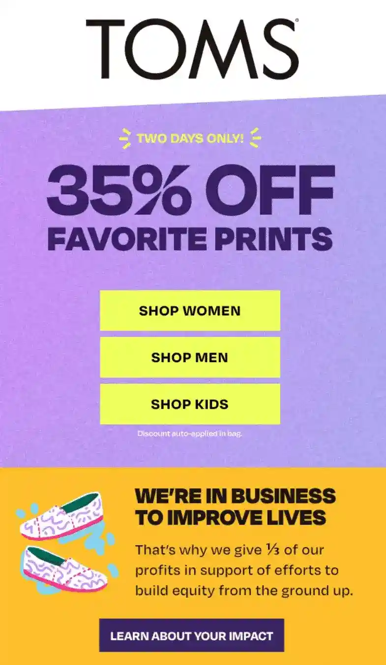
This email design is a good example of how to structure information if you want to tell subscribers several things at once. The deal itself - 35% off - takes ⅔ of the banner space, while also providing direct links to the store. The bottom portion tells about the company’s message and how they (along with their customers) help to build equity. Also, note how the message about “⅓ of our profits” takes up ⅓ of the banner space. Pretty clever.
MagicPattern New Feature Announcement
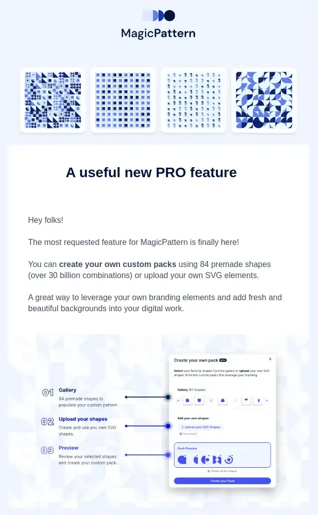
MagicPattern shows how can you lead in by showing value and only then moving on to the announcement. At the very top of the page, they show new patterns that they’ve created using their new feature - custom pattern editor. It then shows a quick demo on how users can use that feature themselves, motivating them to try it out.
Pics.io Feature and Blog Update Newsletter
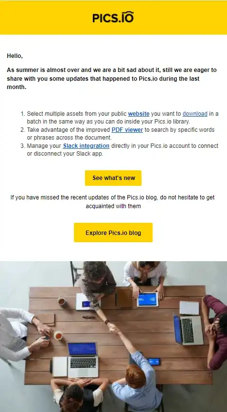
Pics.io newsletter is no-fuss and straight to the point: it lays out the new product features that the users should find useful while also providing a hand-picked selection of the blog articles that may be interesting and/or helpful. For a product that prioritizes saving their user’s time, such minimal approach to newsletter design resonates with the company’s core values.
Upselling Email Design
Upselling emails encourage your customers to purchase a more expensive product or make the upgrade. A successful upselling email will cause the customer to spend more than they initially planned to.
Dollar Shave Club Upselling Email
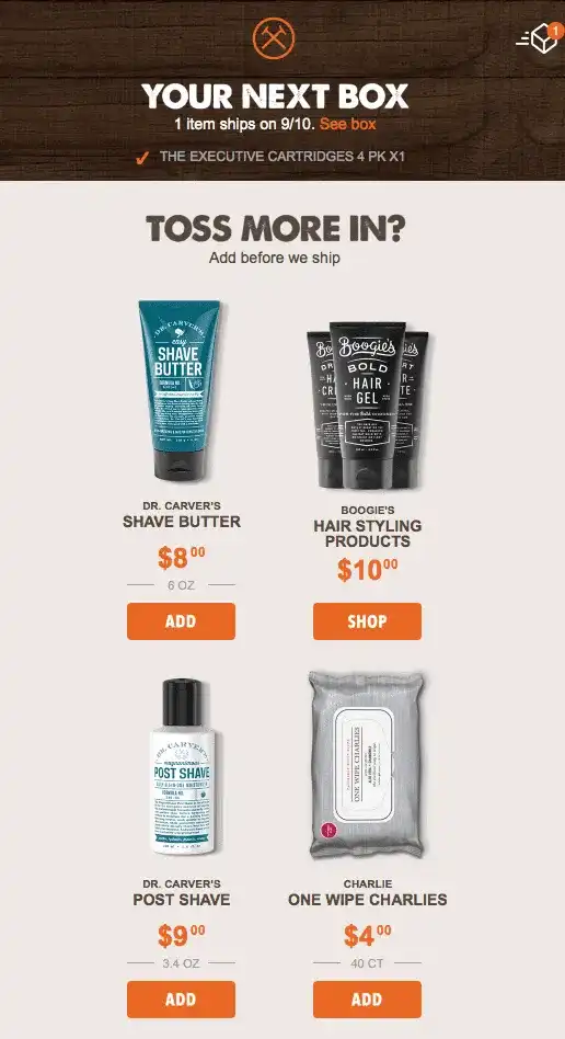
This upsell email makes the process easy for the customer. The sender considers every step the customer makes in their upsell journey. Its recommendations are specific, with each item having its own CTA. This makes it easier for the buyer to choose what they want.
When sending an upsell email, it's advisable to consider the time factor. You can send it when the customer is about to make a payment or purchase something.
Festive Email Designs
These emails focus more on creating and maintaining relationships than promoting the brand. You can send your subscribers a celebratory message on their birthday, during special holidays, or when the brand is celebrating a great achievement. It is not necessary, but you can also throw in a sweet festive deal like a discount or a sample of a new product, depending on your business.
Yeti Holiday Email

In addition to wishing their customers well during the festive season, Yeti uses the opportunity to thank them for choosing to work with them throughout the year. This makes customers feel that you value and appreciate their being part of your team apart from buying your products or services.
Re-Engagement Email Design
Emails can get messy and it’s easy to lose track of even those newsletters that you actually care about. Re-engagement emails act as a gentle reminder about your existence.
Grammarly Re-engagement Email
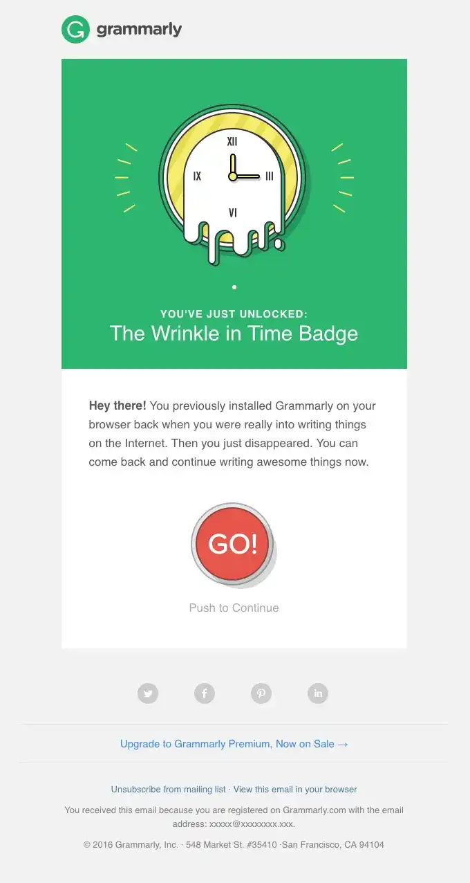
Grammarly’s email cleverly plays on the instant gratification expectations by showcasing a playful “achievement” that the user had unlocked for their absence. It makes the user curious as they wonder what did they do to deserve it. Then, they can either click the CTA button if they simply forgot about Grammarly or just hit unsubscribe if their abandonment wasn’t accidental.
Abandoned Cart Email Example
Cart abandonment is when the user adds products to their cart but don’t complete the purchase.
You should send the customers emails encouraging them to return and complete their checkout process.
Moschino Fashions Abandoned Cart Email
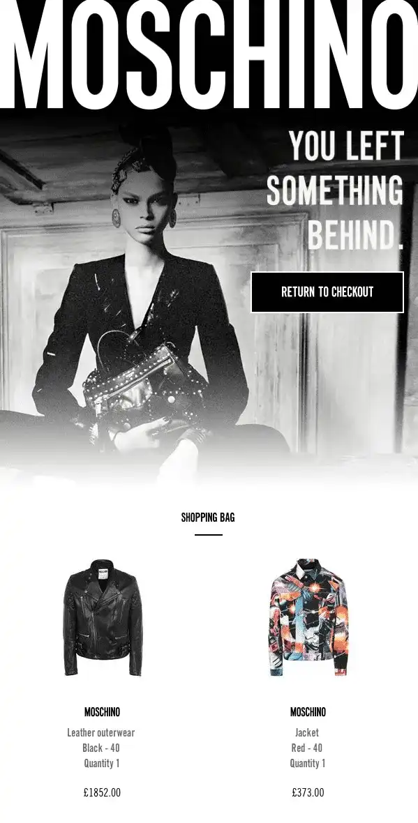
The fashion and apparel brand, Moschino, has a discerning image reflecting in their recovery email campaign. Other outstanding features include a model’s black and white photo, a “You left something behind” caption, and a CTA, “Return to checkout.”
Towards the end, there is a list of abandoned items with their prices and a “Complete my order” CTA. All these encourage the buyer to go back and complete the checkout process.
Key Takeaways On Email Newsletter Designs
From the above email design inspirations, an ideal newsletter should have:
- Easy Readability
- Bold CTAs
- Contrasting colors of elements with negative spaces
- Short sentence paragraphs
Using these tips, you can craft excellent emails with high open and conversion rates. If you’re at loss on where to start, you can use Sender’s template library to get the ball rolling in just a few clicks.
One of the great email banners you’ve seen above - one from Toms - was actually made by Sender.net drag-n-drop email design builder!
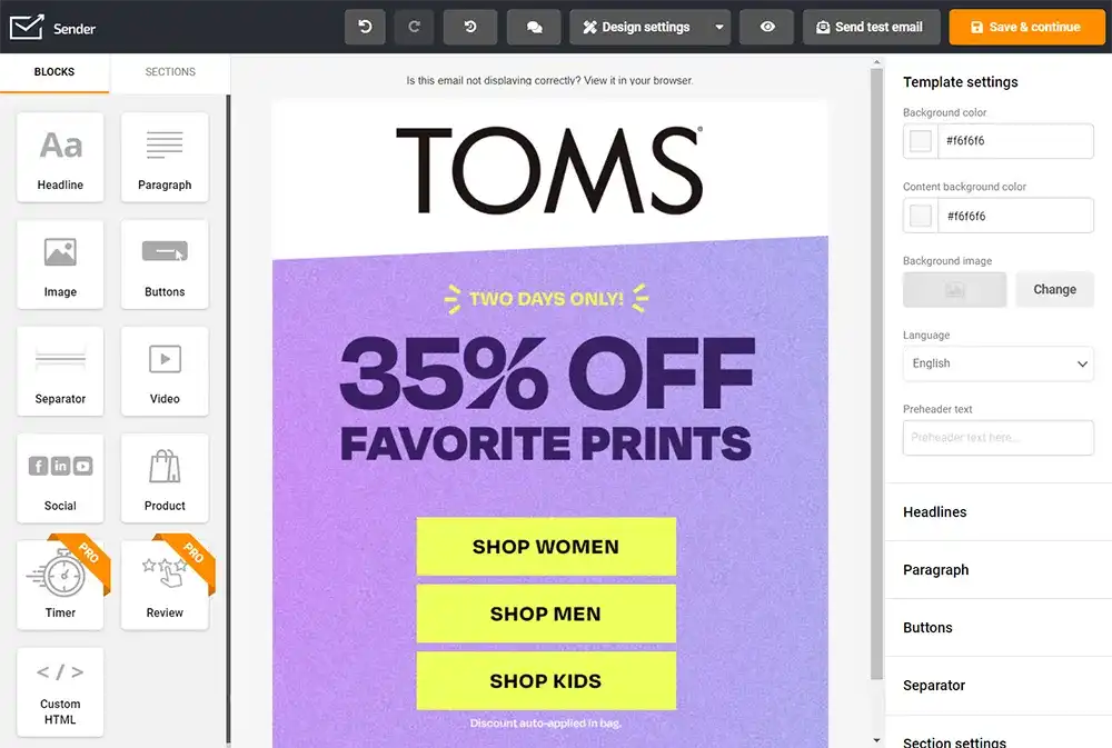
Sender’s builder isn’t just about cookie-cutter designs - you can ado as much as your imagination allows you to!
Boosting Your Email Assets With Digital Asset Management
Sender’s email builder is a wonderful tool but it cannot conjure personalized assets out of thin air, so you’ll still have to do some design legwork to truly stand out with your emails.
While designing email newsletters there are two major pitfalls that can happen:
- Having trouble agreeing on a new design that goes through many iterations.
- Remembering which assets should go to what newsletter.
Modern digital asset management (DAM) solutions such as Pics.io seek to rectify these issues for their users so that the latter can focus on being creative instead of drowning in a quas-bureaucratic hellhole. So, let’s quickly check out how Pics.io can make these two issues a distant (and terrifying) memory.
Version Control with DAM
There are three certainties in life: death, taxes, and your superiors asking to “play around with colors a little bit more”. Revisions are inevitable so best get ready for them, and Pics.io’s version control feature can help you there.
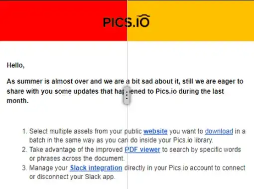
Remember our newsletter from before? Let’s say we’ve decided to mix things up a bit and change the accent color in the newsletter to be more aggressive and bold. So, we’ve tasked our designer to make a mock-up of how it would look before we go forth with a total redesign. With Pics.io, you can treat new versions of the asset not as separate items but as new versions of the previous asset. That allows you to keep everything in one place, and quickly see all changes that have been made to the asset. What’s more, the compare tool helps you to view edits side-by-side to instantly spot the changes:
DAM Helps you to Find the Right Assets at the Right Time
It is a good idea to have newsletter templates premade because when the holiday rush starts, the last thing you want to do is spend precious time scavenging for a Xmas-themed newsletter. Pics.io has a wide range of features that allow you to quickly find the exact assets you need.
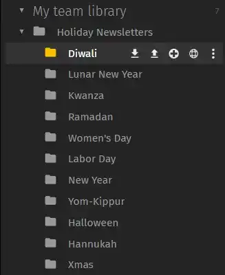
You can create a nested collection where newsletters are separated by holiday:
If you got too many collections to manually scroll through (or you simply hate clicking), you can also use the search function to quickly find all collections, assets, and custom keywords that are associated with your search option.
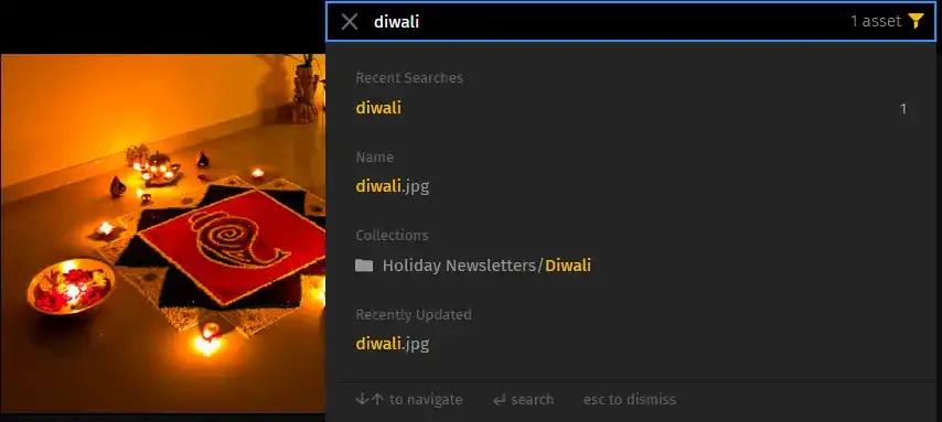
Obviously, for some search functions to work properly, you’ll need to do some initial setup like assigning precise keywords to all assets associated with Diwali, for example. But this initial configuration will help you many times over because you’ll always know where to look for your assets.
Also, if you need to quickly edit some of your assets in Photoshop, Pics.io can help you out here as well. Thanks to the integration with Photoshop, you can get assets from Pics.io to Photoshop (and vice versa) in just a few simple clicks:
Conclusion
Emails remain an important element of marketing strategy, but with how many companies send emails on a daily basis, it is extremely easy to get lost in the crowd. Creating a catchy and memorable design for your newsletter will help with driving more engagement towards your business. And if you want to stay on top of your newsletter assets, the DAM solution is as good as it gets. So don’t hesitate to try Pics.io for free today or you can book a demo with us so that we can answer all your concerns! Keep on rockin’!
Curious? Learn more about Pics.io or book a demo with us and we'll answer all of your questions!
Author
Skirmantas Venckus is a writer by day and reader by night. He hates talking about himself in the third person. He is also the growth hacker at Sender.net – the email marketing provider that is focused on user-friendliness, affordability, and utility. Connect with Venckus on LinkedIn to learn more!


