
In this article, you’ll learn:
Building a website is not as simple as throwing a few pages together and expecting it to work. Many factors go into play, ranging from the various elements, colors, and fonts used, as well as the general navigation. These and many more details come together to create a great user experience.
In this article, we'll share with you the top elements of page layout design you can't miss if you want a site that works well and looks great. Whether you're using a website builder to create your site or working with a web designer to create a custom design, keep these elements in mind to create a page layout that leaves the right effect on your site visitors.
Let's get right into it.
Top Page Element Layout Designs To Consider
Here are some top-page layout design elements you need to consider.
1. Mobile-friendly
One of the top priorities for any page layout should be to make sure it's mobile-friendly. In today's world, more people are using their phones and tablets to browse the web.
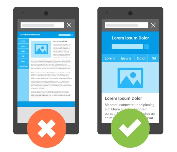
If your site isn't designed to work well on mobile devices, you're likely losing a lot of potential visitors. Ensure your page layout is responsive, so it looks great no matter what device someone uses.
Having a responsive website is also a fundamental part of SEO.
2. Direct And Specific CTA Buttons
Gone are the days of having multiple CTAs (calls-to-action) on a page. These days, it's generally all about simplicity and making it easy for visitors to take the next step.
Your CTAs should be clear and concise and stand out from the rest of the page. Use colors and other design elements to make them pop, but don't go overboard.
Regarding the words used on such buttons, ensure they're action-oriented and tell the visitor exactly what they need to do or what outcome they will achieve if they click on such page elements.
For instance, a CTA like learn how to create a website from scratch can be a powerful tool for beginners looking to start their online journey. This direct approach not only guides users effectively but also instils a sense of accomplishment once they embark on this learning curve.
3. Background Videos
A recent trend in web design is to use background videos instead of images. This can be a great way to add some movement to your page without making it too busy.
Just make sure the video is valuable to your visitors and relevant to your brand. It should also be muted at startup so it doesn’t take visitors by surprise.
Most importantly, if you plan on using a video in landing page, ensure that it's hosted on a third-party site that can deliver it at a speed that's fast enough for your visitors. Having self-hosted videos might save you money but will generally slow down your site significantly.
4. High-Quality Imagery
Whether managing a design team and needing to communicate ideas or wanting to make the most of working with a professional photographer, getting high-quality imagery for your site is a must.
Your users will appreciate it if you post excellent pictures on your site instead of using cheap, professional-shot photos. Said differently, people are likelier to trust and engage with a site that uses natural, high-quality images.
When it comes to page layout, imagery can also add visual interest, break up the text, and highlight specific elements. For example, the right images in your blog posts break up text and make it easy to add visual appeal.
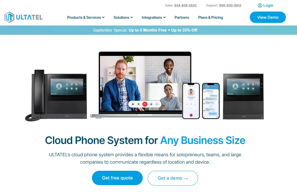
This cloud-based phone system website offers an excellent example of how images can be used at the center, top of the fold section of a webpage to make a strong impression.
5. Branding
There are various ways to empower your brand identity through your website. The most common one (and probably the easiest) is to use your brand colors in the design. Your brand colors should be used throughout the site, not just on the homepage. They should be consistent on all pages and should be used in a way that complements the overall design.
Another great way to incorporate branding into your page layout is to use your logo. Make sure it's placed in a prominent spot where visitors will see it as soon as they land on your page. Your logo should be linked to your homepage so visitors can easily navigate back to it. It should also be used in your site's favicon and social media icons.
6. Personalization Options For Users
Personalization has become essential in recent years, whether building a simple personal website or having web applications developed for business needs.
As we all know, people like feeling special, and if they see that you've made an effort to personalize the experience, they're more likely to stick around. There are various ways to personalize a website.
One is to use the user's name throughout the site. Another great way to personalize your page layout is to use user location data. This can show relevant content or products based on where the user is located.
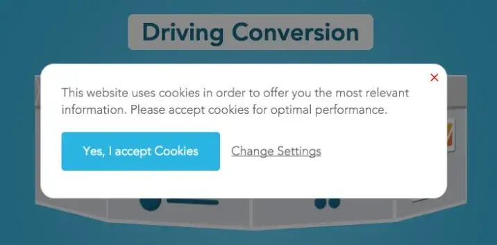
You can generally use cookies to track user behavior and show content relevant to their interests - just make sure you let visitors know about this when they land on your site.
7. Speed Optimization
One of the most important aspects of a page layout is speed optimization. In today's world, people have short attention spans and are unwilling to wait for a slow website to load.
A great way to optimize speed is to use compressed images. This can reduce the file size without affecting the quality. Another great way to speed up your page layout is to use a content delivery network (CDN). This can help deliver your content faster by caching it on servers worldwide.
You should also avoid using too many animations or heavy elements that could slow down your page. And last but not least, make sure you're using a good hosting provider that can deliver fast speeds.
8. Social Media Integration
Social media integration is a must in today's world. Making it easy for visitors to share your content on their favorite social media platforms is key. The most common way to do this is to use social media icons. These should be placed in a prominent spot on the page, such as the header or footer.
When someone clicks on one of the icons, they should be taken to the corresponding social media platform where they can share your content.
Another great way to integrate social media into your page layout is to use social media feed widgets. These can show your latest tweets, posts, or even photos from such networks.
9. White Space
White space is an essential element of page layout design. It's often overlooked, but it can make a big difference in your site's overall look and feel. White space can be used to create contrast and visual interest as well as highlight specific aspects of your page.
When using white space, it's essential to use it intelligently. Too much white space can make your page look empty and unfinished. Instead, use white space to enhance the other elements on the page. For example, you could use it to frame a vital image or piece of text.
Or you could use it to create a sense of hierarchy by making certain elements stand out more than others.
10. Minimalism
Minimalism is a popular trend in page layout design. This style is all about keeping things simple and clean. This simply means there are no frills or extra elements. Everything on the page serves a purpose and is there for a reason.
When designing a minimalist page layout, less is more. You want to use as few elements as possible while achieving the desired effect. Combining minimalism and white space can create a sense of balance and visual interest.
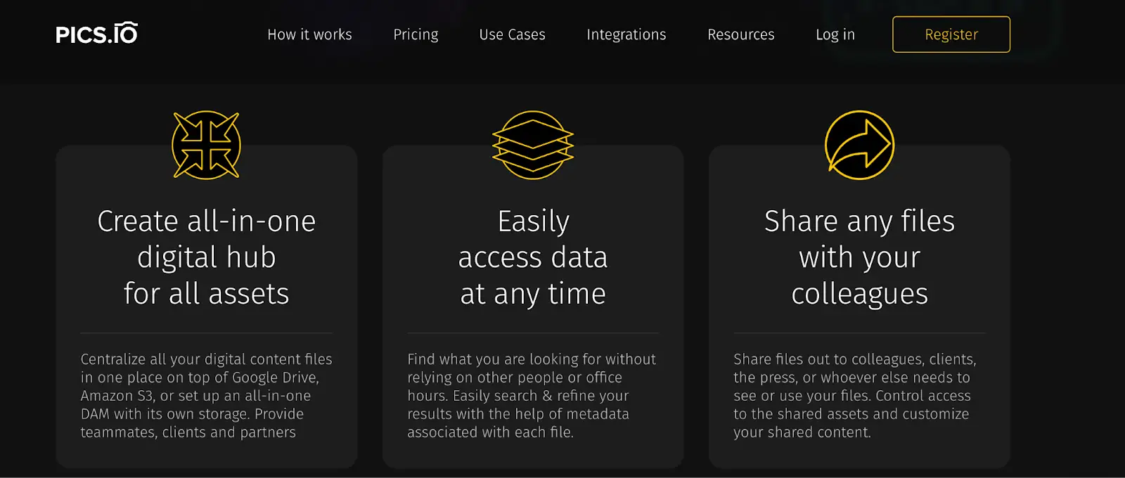
For example, on Pics.io, you can see that some of the features have their own box element, with plenty of space around them. This creates a sense of visual interest and draws the eye to such individual features.
11. Information Accessibility
Whether you're in the process of developing a page layout to create a compelling ecommerce brand or an informative blog layout, information accessibility is paramount. Your customers or readers should be able to find what they need without difficulty.
To ensure information accessibility, use clear and concise headlines and subheadings. Breaking up your text into smaller paragraphs can also make it easier to scan and read.
You should also use bullet points or lists whenever possible. This can help break up the text and make it easier to digest.
Also, visually impaired users will access your page layout via screen readers. As such, you must ensure that your text is formatted correctly and uses proper tag hierarchy.
12. Content-First Approach
A content-first approach is a page layout strategy that puts the content before any other elements.
When designing your page layout, you could start with the content and add other elements afterward. The general thought process here is that since content is the most essential part of the page, everything else should be secondary and revolves around the most important thing.
A content-first approach can help create a more user-friendly and effective page layout. It also forces you to think about what's truly important on the page and what can be left out.
This is useful in various situations and industries that revolve around using words to deliver information. For example, if you're designing a site in the news or media industry, a content-first approach is ideal.
13. F-Shaped Pattern
The F-shaped pattern is a common way that people read web pages. Studies have shown that people scan web pages in an F-shaped pattern.
This means they first read the headline and then scan down the page, reading the left side of the content more than the right side. When designing your page layout, you need to keep this in mind. Make sure that your headlines are clear and concise. And use subheadings to break up your text, so it's easier to scan.
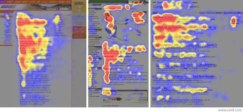
You should also place the essential information on the left side of the page. This is where people's eyes will be drawn first.
14. Hamburger Menus
Many sites are now also adopting a hamburger menu. If you're unfamiliar with the term, this is a three-lined button you see in many websites' top right or left corners of many websites.
Clicking on it will usually reveal a hidden menu, which can be used to navigate the site.
Hamburger menus are popular because they're simple and efficient. They save space and can help declutter a page layout.
However, they do have their drawbacks. Hamburger menus can make it more difficult for users to find what they're looking for. They can also be confusing, especially for first-time visitors to a site.
As such, you should only use hamburger menus if you're confident they won't adversely affect the user experience. Understanding which menu items should be put in (and conversely, which ones should be left out) the hamburger menu is essential for success.
15. SEO Boosting Elements
If you want your site to rank high in the search engines, you need to include certain elements that will help boost your SEO.
Some examples of these elements include:
- Title tags
- Meta descriptions
- Header tags (H1, H2, etc.)
- Alt text
- XML sitemaps
Including these elements on your pages can help improve your chances of ranking higher in the search results, leading to more traffic and more customers for your business.
When it comes to page layout, you need to ensure that these SEO-boosting elements are prominent. For example, your title tags should be placed near the top of the page and be easy to spot.
16. Visual Hierarchy
We’ve briefly touched on this, but it’s worth going into it in a bit more detail. Visual hierarchy is how users process information on a page. People will generally notice and process data higher up on the page before paying attention to anything else further down.
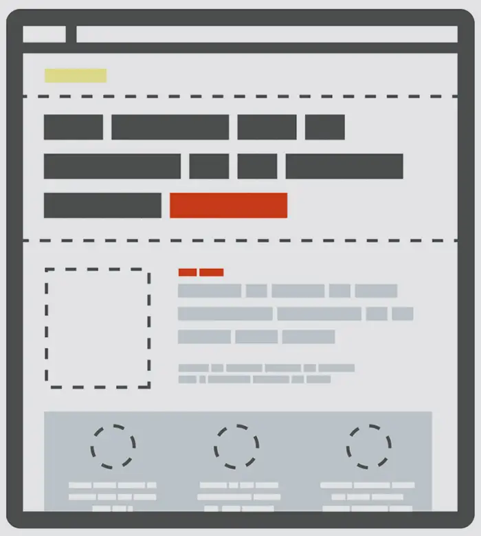
When designing your page layout, you need to consider visual hierarchy. For example, if you want people to click on a particular button or link (more than other elements), you need to ensure that it's placed in a prominent position on the page. This means that higher up, the better.
Conclusion
The above elements are some of the most important aspects of page layout design. If you want to create a well-designed, user-friendly, and effective page, you must ensure that these elements are included.
At the same time, you don't have to implement all these elements at once. Testing each aspect to see how it affects your page's performance is also an excellent way to ensure you get the most out of your design.


